Створюємо САЙТИ &
Ведемо Бренди ДАЛІ
(seo, Google Ads, smm)
https://dalistrategies.com/
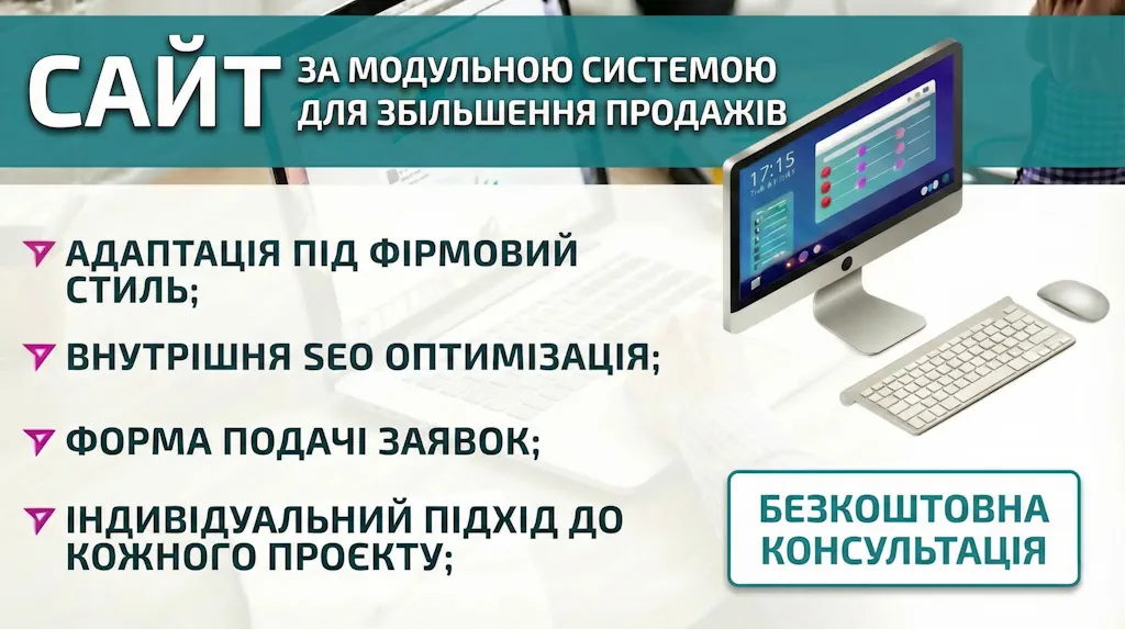
You can order from us розробку сайту під ключ будь-якої складності за модульною системою для збільшення продажів. Ми не обмежуємо вас у виборі: потрібен бізнес-сайт за модульною системою чи односторінкова Landing page – зробимо, якщо потрібен інтернет-магазин зі складним нестандартним функціоналом — теж не проблема. Якщо ви не знаєте, який сайт підходить саме вашому бізнесу, ми допоможемо вам визначитися: в деяких випадках потрібен нетривіальний підхід.
Stages of implementation projects
For whatever purpose a website is created, work on it goes through several main stages:
Our projects
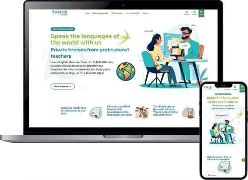
We developed a modern system for booking classes in 5 languages for the client, including: Spanish, English, German, Russian and Ukrainian. The result was an interactive "Online School" that allows you to choose a subject, time, day, duration of the lesson according to the teacher's schedule and accept online payments. The system is integrated with the Google calendar of each teacher separately with payment through the international Paypal system. Additionally, Zoom or Google Meet is connected to create lessons. Each student and teacher has their own accounts to view booked classes and can change the time and date or contact the student if necessary. The site uses the corporate email domain mail@levitinlanguageschool.com, which is connected to the client's Gmail application and allows you to conveniently view or send emails from it. And now for the features:
- Responsive design, so you can book from any device;
- The ability to customize the service for a specific employee who will perform it;
- Booking an appointment without the need to contact, an automatic process;
- Sending an email or SMS reminder about an online booking;
- The ability to manage your customer base and online appointment calendar quickly and efficiently from the administrative panel;
- Add an unlimited number of customers to your database, searchable and sortable;
- Protection against hacker attacks, etc;
A modern, fast and optimized website for a client engaged in online transportation. The design of this site combines a simple interface and a unique color gradient according to the client's wishes. We implemented a photo gallery, a menu, and contact forms for sending messages to a private Telegram group or email. Each page has a unique content and reflects the essence of the service. Received requests from the site are classified by which page they come from, and the forms are connected to the spam protection system. We also connected protection against password guessing and hacker attacks to disable the server. We carried out basic Seo optimization for indexing by search robots and connected to Google Analystic and Search console.


The project of a modern dental office was designed in a minimalist style to advertise services and collect applications from advertising campaigns and organic traffic. To do this, we formed the concept, layout, style, and identity according to the client's requests, which allowed us to create a unique design that allows you to promote the services of a dental office and promote business awareness. The site has a list of doctors, which is automatically linked separately according to the services provided by each doctor personally and displayed on the page of this service. Responsive design for mobile and tablet devices. Contact forms for sending messages to a private Telegram group or email have been connected and configured. From the received forms, the client can find out from which page the request was sent and the basic information: phone number, sender's IP address, and date. Special attention was paid to optimizing the site's loading speed so that even with a poor 4G connection, the site could load gradually and without delays.
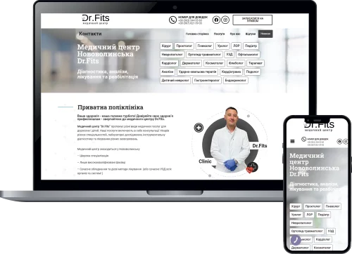
In this project, we developed an informational website to promote the services of a meth center. The main goal was to optimize the site for mobile devices and promote it in Google's organic SEO results. To do this, we analyzed competitors and created a concept, design, and identity that would provide the most convenient use of the site to advertise the center's services and receive applications from clients. For each service, of which there are more than 20 on the site, a separate page was created with search engine-optimized texts, a list of doctors and contacts. Contact forms with sending messages to a private Telegram group or by email have been connected. Protection against hacker attacks and password guessing was provided, and targeted advertising was set up for the target audience interested in the medical center's services.

This project is designed for a reliable driving school "Engine.". It combines an attractive modern design that is adapted for mobile devices and optimization for fast web browsing and receiving applications from clients. In addition to the main landing page, we created separate pages for different advertising campaigns to promote the school's services. Within 6 months of additional SEO promotion, the school's website was brought to the Top 3 for the query "driving school Ternopil" and the Top 10 for "driving courses". Contact forms for sending messages to a private Telegram group or email are connected to the site. Received applications from the site are classified by which page they come from, and the forms are connected to the anti-spam mailing system. Protection against password guessing and hacker attacks to bring down the server is connected. GTM, Google Analystic, Facebook Pixel, and Search console electronic accounts were created and configured. Separate work was done in Google Business to promote the website and brand locally through Google Maps.
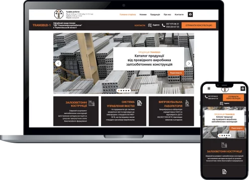
We needed a website that would advertise our product catalog - this was the request we received from official representative of Khmelnitskazizobeton ALC. Therefore, we implemented a classic 50/50 catalog store for it, where each product has its own page and a convenient admin panel where you can quickly add, change, or update information about each product. The result was a branded website focused on organic search with connected feedback forms, a product photo gallery, and contact information for communication and ordering services from the client. In addition, we provided everything necessary for good promotion in search results and protection against malicious hacker attacks on the site.

Developed a website for a network of medical beauty centers "Vitamin". The result is a simple business card site, not burdened with additional animation, for advertising services and receiving applications from advertising campaigns. The site is divided into several sections, each section has its own unique top and bottom part with contact information and phone numbers of the department that processes orders. We also implemented a number of prices that can be easily changed from the admin panel and created electronic accounts in Google Analystic and Search console. Additionally, the site is protected from password guessing in the administrative panel.
Our team has developed and implemented a website for the company Terdobrobudis a construction and repair services company. From the very beginning, we focused on developing a concept that would match the corporate style and goals of Terdobrobud. We conducted a detailed study of the audience and business requirements to create an aesthetically pleasing and easy-to-read website with a responsive design that takes into account the specifics of the size of modern mobile device screens through which users can view the site. This ensures optimal display and functionality of the site on any device - from desktop computers to smartphones. The result is a business card site focused on organic search with connected feedback forms, a gallery of photos of completed projects, and contact information for communication and ordering services from the client. In addition, we provided everything necessary for good promotion in search results and protection against malicious hacker attacks on the site.

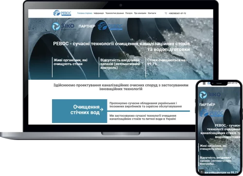
Developed a project for the company Rewosis a company that specializes in the design and implementation of turnkey sewage treatment systems. Our team has created this website taking into account all modern requirements to ensure maximum user convenience and effective presentation of the company's services. We created an intuitive interface that allows visitors to quickly find all the necessary information about Rewos services and products. The layout is based on adaptive design, the site looks good on any device - from computers to smartphones, which ensures comfortable browsing in any conditions. The site structure is designed in such a way that all sections are logically organized and easily accessible. Visitors can get acquainted with each stage of the wastewater treatment process in detail, view completed projects and get advice from specialists.To ensure high positions in search engines, we have conducted a comprehensive content optimization, which allows us to attract more potential customers.
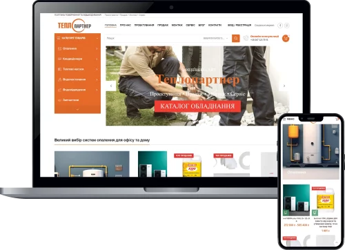
Our team has developed and implemented a website for the company TeploPartneris a company that specializes in the sale and installation of complete heating systems, as well as air conditioners, boilers and other equipment. Our team has created this website with all modern requirements in mind to ensure maximum user convenience and efficient delivery of the company's services. At the design stage, we provided an intuitive interface that allows visitors to quickly find all the necessary information about TeploPartner products and services. The site is optimized for screen resolution on any device, from a computer to a smartphone. The structure of the website pages is designed in such a way that all sections are logically organized and easily accessible. Visitors can learn in detail about the characteristics and advantages of each product, see the catalog of other products, the list of services and get advice from the manager. Integration with the payment and delivery systems of Nova Poshta and Ukrposhta has been implemented. To ensure high positions in the search engine, basic Seo optimization was carried out to gradually raise the site in the search engine rankings.
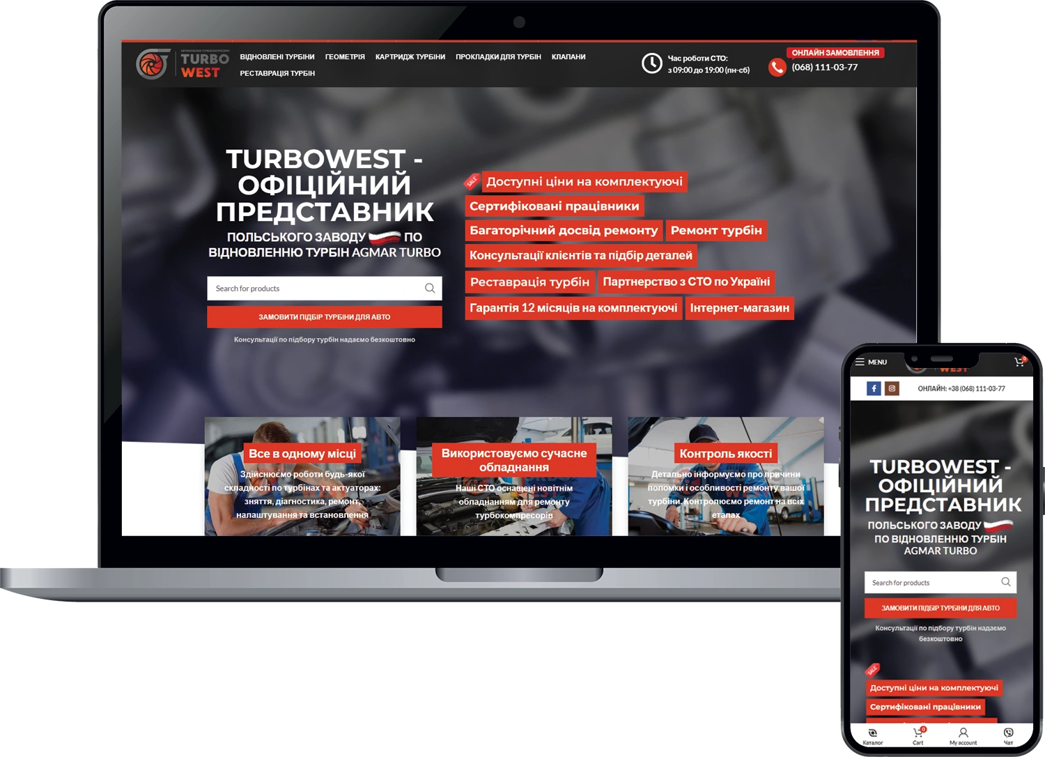
Creating an online store for a service station chain "Turbowest"
The company turned to us to create a website for image purposes and to attract new customers.
⠀
Our team divided the work process into several parts:
-analysis of competitors' websites;
-designing the main elements of website design;
-development of the graphic part and product management logic;
-Website layout;
-filling the site pages with the materials necessary for indexing;
-Setting up price conversion according to the exchange rate (you specify the price on the website in a currency, and the buyer is shown the updated price in UAH);
-Pages for accounting for orders, products, and comments for them have been implemented;
-an informational blog with articles about new products and other materials;
A full-fledged shopping cart where you can customize the rules for placing an order and recommend products for purchase;
-internal and external SEO optimization.
⠀
We got a modern online store with premium features and search engine optimization
As Bill Gates said: "If your business is not on the Internet, you are not in business."
In today's realities, any business needs a website. And this is a great solution for presenting you and your products in the virtual world.
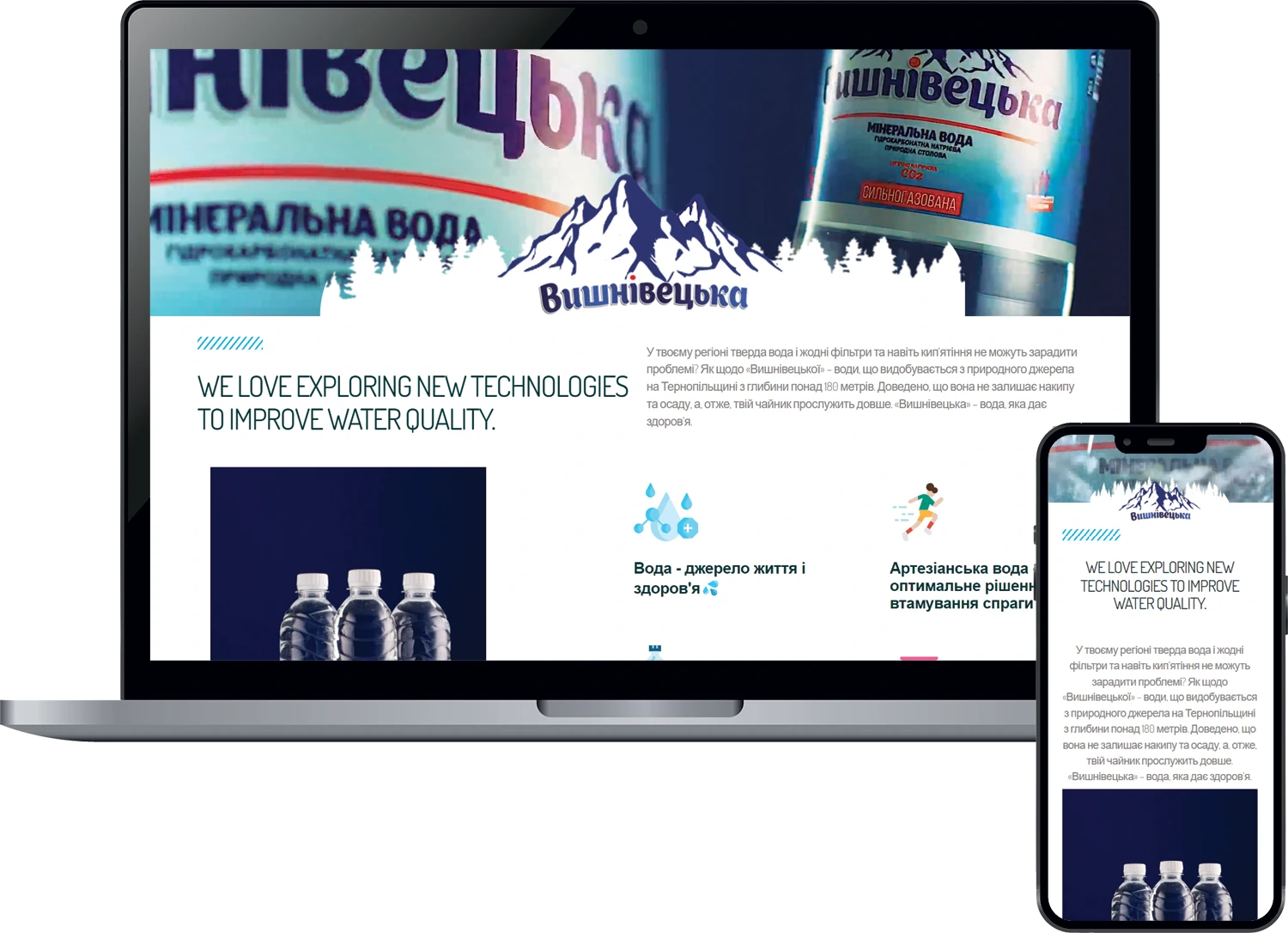
Our new work is a website for Vyshnivetska Voda
Production time: 3 months
You can familiarize yourself with it by following this link https://vyshnivetska.ua/
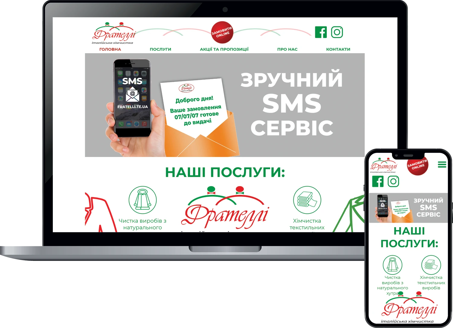
We present you our new work! Website for Italian dry cleaning "Fratelli"
We mixed bright dynamic design, unique selling content, and primary SEO optimization. All of this was additionally adapted for mobile layout and we got a website where you can view all the services and promotions.
Now you know exactly where you can get your clothes, bedding and many other useful things cleaned with high quality...
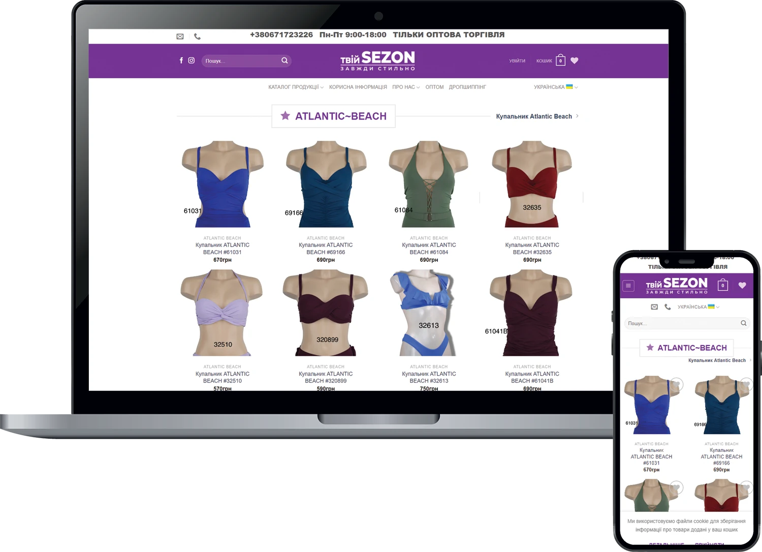
Online store for "your SEZON".
Website with individual design on the "engine" Opencart.
A great solution for placing an unlimited number of products.
- User-friendly interface and site navigation, quick start, adaptive layout - your online store will be perfectly displayed on any device, from a compact smartphone to a huge computer monitor.
- SSL-enabled security and SEO orientation.
Redesign of the website of ENT specialist Tatyana Atamanyuk.
We changed the look of the site (created separate pages for services, updated the site design, added the ability to leave a request on the site) and added new sections: Contacts, News, Prices, Training.
The site was on Tilda, so I transferred it to WordPress.
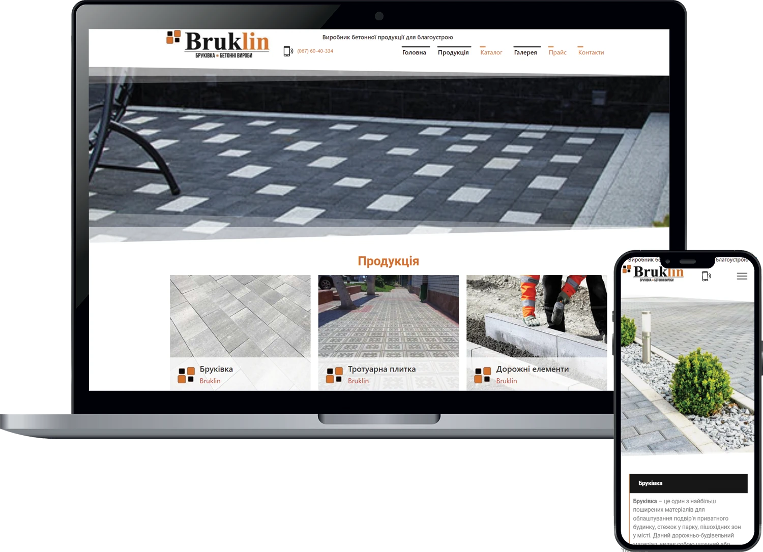
Creation of an information catalog site for the manufacturer of paving stones and concrete products Bruklin.
The company asked us to create a website to advertise its products and attract new customers.
⠀
Our team divided the entire process into several parts:
▪ analysis of competitors' websites;
▪ design and development of the main elements of the website design;
▪ adaptive website layout;
▪ filling the pages of the site with the materials necessary for indexing;
▪ product, catalog, gallery, and price list pages have been implemented;
▪ internal and external SEO optimization.
⠀
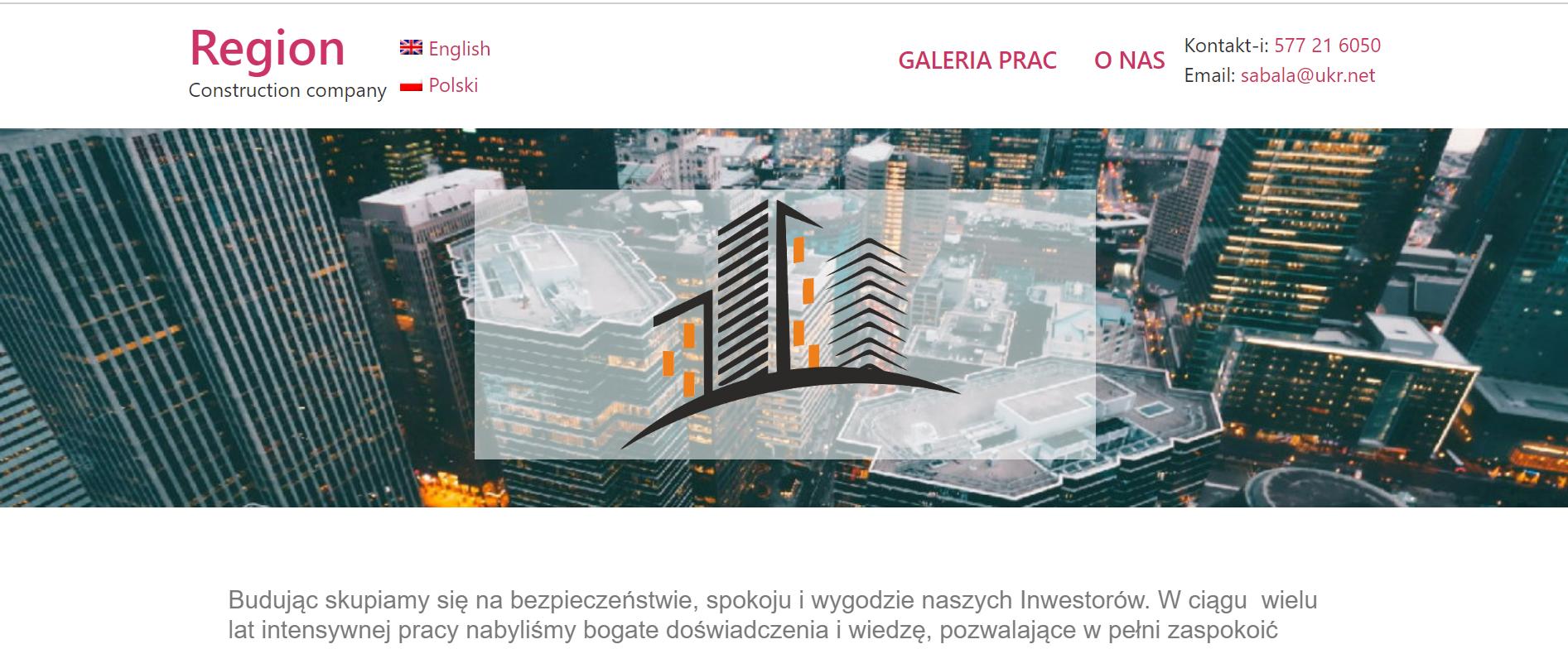
Website development for a construction company "Region" from Poland.
The company turned to us to create a website for image purposes and to attract new customers.
⠀
Our team divided the entire process into several parts:
Competitor analysis,
▪ Website design,
Front- and backend development,
▪ layout,
▪ website content,
Internal and external SEO optimization.
⠀
The project turned out to be bright, but at the same time restrained.
The creation of a business website using a modular system includes:
- Mobile and tablet versions of the site.
- SEO copywriting for 2000 characters.
- Photo processing and compression.
- Adaptation to corporate identity.
- A gallery of photos from Lightbox.
- Feedback form by email.
- Interactive Google map.
- It is possible to "embed" a video into a Youtube site.

