Project.
Lvel Up is a foreign language school that provides comfortable learning for children of different age groups and students preparing for the Unified State Exam. It also organizes winter and summer camps for children. Core values: quality, accessibility, price.
Objective.
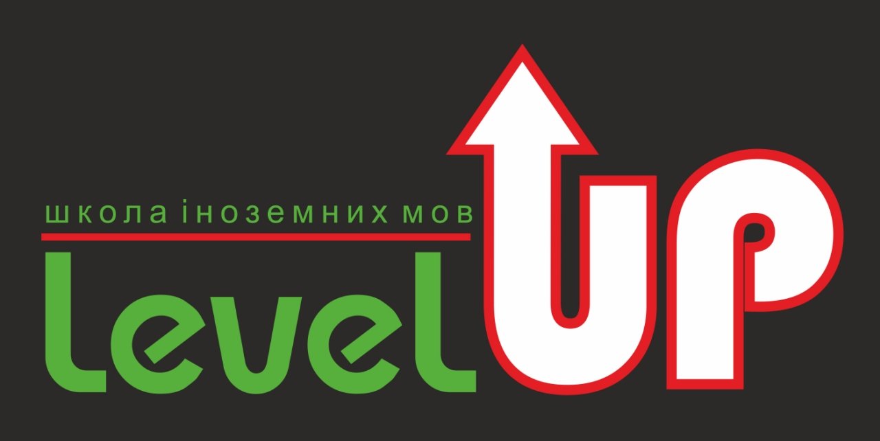
To develop a minimalistic, stylish logo that inspires confidence and forms the image of a status school of foreign languages. Black, red and green colors were used in the design.
Logo
The graphic sign was built from the correct shapes: arrows and lines. These figures represent the desire for success and new knowledge.
We chose a geometric font that looks simple and laconic. Its bolded strokes retain readability and add significance to the name.
Color scheme
The dark red color scheme with a touch of green is in keeping with the style of the logo.
The psychology of color:
- Black - laconicism, strength, durability,
- Green is a symbol of peace and security,
- Red represents energy and strength.
Visual identity
We recommend sticking to minimalism in style: a logo and monochromatic backgrounds. The status is conveyed with the help of materials and non-standard printing: a three-layer business card made of matte textured designer cardboard, an original project folder.
Need a brand style? We'll answer questions, consult, and discuss the details:
► https://www.facebook.com/dali.win1.0/
► https://dalistrategies.com
► (068) 510-61-55 (Viber / WhatsApp).


