
If you suggest today that logos are created by designers simply because they are inspired, you will definitely be laughed at.
Trends change from year to year, giving rise to rebranding, and individual phenomena become a source of inspiration and entire trends. Let's figure out together what's happening in the world of logos now.
Function over design
It's no secret that many "fads" become outdated over time. Ornate fonts with strokes are increasingly giving way to laconic images and signs. Many brands whose colors and symbols have survived for several decades, or even a good hundred years, eventually abandon typography in their logos.
Simple geometric shapes, overlapping objects
In general, the ability to combine the simplest silhouettes and get interesting spots by intersecting them is one of the basic things in design. And everything that is basic and classic and works with the right approach.
Transformation of classicism, a combination of heraldic motifs and fine lines
Classics invariably create a sense of reliability. And what could be better when there are one-day firms around and you need to make it clear that your business is not like that?
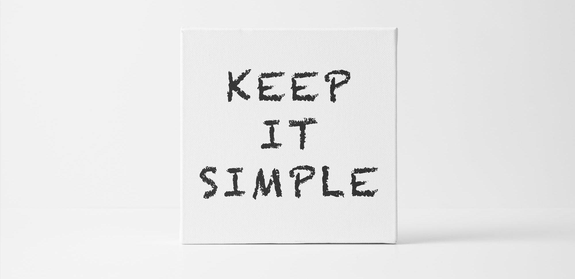
Simplification of forms is the leitmotif of recent years
Any stylization starts with a rather complex image. However, if you follow this path further, you can come to a laconic logo.
Some transformations are so smooth that they are almost invisible to the user, while the logo remains recognizable. But designers always notice such updates and try to keep up.
Rounded edges
Smoothing the outline often relieves some of the tension of a sharp geometry. It also gives the logo a more complete look and goes well with many fonts.
Bold and serif fonts, serif fonts seem to be making a comeback
The fashion for fonts is cyclical, like any other. Gradually, simple fonts or typography that imitates hand calligraphy fade into the shadows, and bold fonts with more or less obvious serifs take center stage.
The desire for minimalism and maximum simplification requires companies to be very careful about the rest of the expressive means, and a "strong" font is one of the main ones.
Punctuation as an amplifier of the logo meaning (full stop), emotional coloring of the word (comma, colon)
Everyone knows that a single comma can completely change the meaning of an entire sentence. It's the same with logos. Correct punctuation enhances their meaning.