Logo design is very important for small business development. Logo is one of the branding strategies on which market recognition and, accordingly, profit depend. Our specialists regularly follow new trends, because today the opposites are used peacefully: minimalism with layers of elements or small elegant letters with a massive font. What logo design trends does 2020 offer?
Conciseness
More and more companies are simplifying logos. Extra details, slogans are removed, the font increases. Minimalism in logo design only strengthens the position, because such simple formats are better adapted to any digital version, plus they are much easier to remember with such a huge amount of information.
Unique fonts
Minimalism in design has led to the fact that many text logos are very similar.
Therefore, you should pay attention to the original fonts. Such a bold decision can be created from scratch. This will help you stand out from the competition and come up with a really noticeable logo. It is important that the text is easy to read, appropriate to the nature of the company and easily adaptable to different digital formats.
Using a gradient
The use of a gradient is still a trend, but it becomes softer and the transition smoother. The text should remain in one color scheme, without sharp transitions. This technique makes the logo three-dimensional and stylish. Another option is to use black. This is a very stylish solution that attracts attention. It is only important to make sure in advance that the text will be displayed correctly when printing and in the mobile version.
Layering of symbols
To make the logo more creative and not look like the identity of competitors, you should work with several elements. You can superimpose letters on each other, use creative graphics, replace one letter with a geometric shape, apply contrasting colors. Such techniques immediately attract attention, so the logo is quickly remembered.
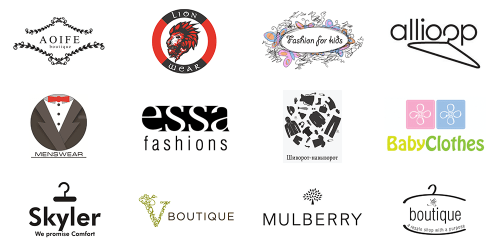
Thin lines
One of the main trends of 2021 is minimalism and simple forms. Discreet color (mostly black), subtle strokes and simple fonts will make the logo elegant and aristocratic. You can use spaces between letters and geometric elements.
Chaos
This asymmetrical technique is suitable for creative brands. You can place the letters on the steps, replace the letters with figures or come up with your own design solution. But remember, even chaos has a structure. Therefore, the mess must be thought out.
Harmonious solution
The counterbalance to chaos is symmetry. The restrained, conservative logo remains in trend. Its characteristics: simple graphics, expressive font, calm colors. The advantage of this option is seamless adaptation to any scale.


