
Unlike many global brands that use a thoughtful and even often philosophical approach to their naming and logo design, the story of Adidas looks more "banal". After all, the name of the German brand is just a derivative of the name of its founder Adolf (Adi) Dassler. However, the history of the brand's visual image is not so simple.
Being a true sports fan, Adi Dassler began designing the first models of sports shoes immediately after returning from the First World War. But it wasn't until 1924 that Adi and his brother Rudolf (Rudy) officially registered the Dassler Brothers Shoe Factory (Gebrüder Dassler). A year later, Adolf invented and produced the world's first spiked soccer boots, which proved to be so comfortable that they quickly became popular.
To advertise their products, the brothers decided to rely on cooperation with athletes. Athletes began to compete in Dassler shoes at the 1928 Summer Olympics in Amsterdam. And at the 1936 Olympics in Berlin, American runner Jesse Owens won four gold medals and set five world records in their shoes.
For the first time, Owens' cleats feature Dassler's signature two stripes, designed to better hold the construction together and symbolize the two brothers.

The Second World War probably made the most significant adjustments to the development of the family business and the relationship between the brothers. The Dassler factory was nationalized, and the brothers were sent to the front. And while Adolf was returned to the factory a year later to make training shoes for German soldiers, Rudy was unlucky enough to end up in the American occupation zone, and then in a prisoner of war camp. The resentment against his brother for his unwillingness to help him escape from captivity never left Rudolf for the rest of his life. Therefore, after the end of the war and the death of their father in 1947, the brothers finally quarreled and divided the production. Adolf named his company Addas, and Rudolf named it Ruda, and a few months later both renamed their companies Adidas and Puma.
Over time, these two firms became irreconcilable competitors, at least in Germany. On the other hand, this served as one of the main of the main incentives for the development of the entire industry.
The first Adidas logo appeared in 1949. And it looked like an image of a three-striped boot held by deliberately elongated elements of the letters "d" in the Adidas name. And on top, in the form of a semicircle, is the name Adolf Dassler's name is on the top.
It is worth noting that the text part of the logo reflects the font constructivism that was popular in Germany at the time. Later it would become one of the most striking typographic trends and would be strongly associated with "German" thanks to fonts like Futura and experiments with geometric grotesques of the Bauhaus period (1919-1933). This is also where the satirical spelling of all the letters of the logo comes from.
Few people know that at that time there was a Finnish brand sportswear brand Karhu, which also used three stripes in the design of its in the design of its products. However, Adolf Dassler managed to negotiate and buy the "three stripes" from the Finns "three stripes" for $ 1800 (in today's equivalent) and two bottles of whiskey.
In 1952, Adidas began to produce other products: sports bags and tracksuits with three stripes along the sleeves. Thus, the three stripes became the main brand motif.
In the early 1970s, Adidas decided that it needed to a global rebranding effort and create a dynamic logo that would characterize the brand as more diverse and more than just than just high-quality sports shoes. The presentation of the new redesign also coincided with the the 1972 Munich Olympics.
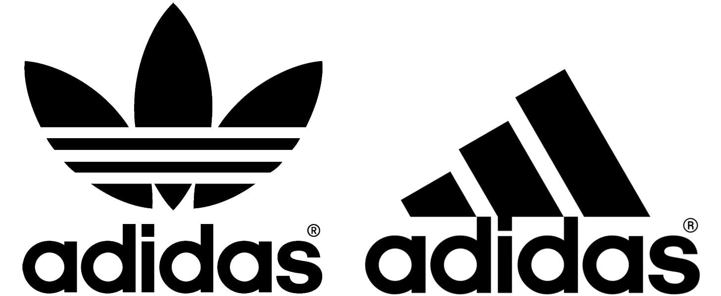
The new logo was a shamrock with three branded stripes in the lower half of the emblem. The shamrock depicted a stylized world map with three continents where the company's products were sold at the time. The first leaf represented North and South America, the middle leaf represented Europe and Africa, and the third leaf represented Asia.
The three horizontal stripes symbolized diversity. This logo is still in use today. Only now it is used to brand the Adidas Originals collection. It is thanks to this rebranding that the brand has gone beyond sports equipment and become part of everyday street fashion.
Nowadays, advertising campaigns have started to use images not only of athletes, but also, for example, musicians such as David Bowie or Run DMC.
After the death of Adolf Dassler in 1978, Adidas faced extremely difficult times. A series of management changes began, which brought the company's of the company at the brand level stalled. This was happening against the backdrop of growing sales of the main competitors - Nike and Reebok.
The rapid development of footwear technology and design aesthetics in the the 1990s meant that it was time for Adidas to renew its identity once again and save the company from bankruptcy.
In the early 90s, after the success of its futuristic ZX shoe series, Adidas introduced a new line of professional equipment, Adidas Equipment, which was designed "to meet the special needs of professional athletes in various situations."
The new logo still retains the signature three stripes, only in this version, thanks to the slope, they also turned into a "mountain" - a symbol of overcoming the difficulties and challenges faced by athletes. Despite the fact that a wave of criticism followed, calling the new logo too simple and boring, seven years later in 1997 it became the main logo of the entire Adidas company.
Unlike its main competitor Nike, Adidas has never had a main slogan comparable in strength to "Just do it". In 2004, the company released perhaps the most successful advertising campaign with the slogan "Impossible is nothing," featuring famous athletes of the time, such as David Beckham and Muhammad Ali. However, this slogan never managed to become the slogan of the entire brand.
Throughout the 2000s, Adidas made several minor changes to its brand, officially establishing Adidas Originals in 2001 and gradually abandoning the Equipment logo. The brand identity was simplified to a classic text logo with three horizontal stripes.
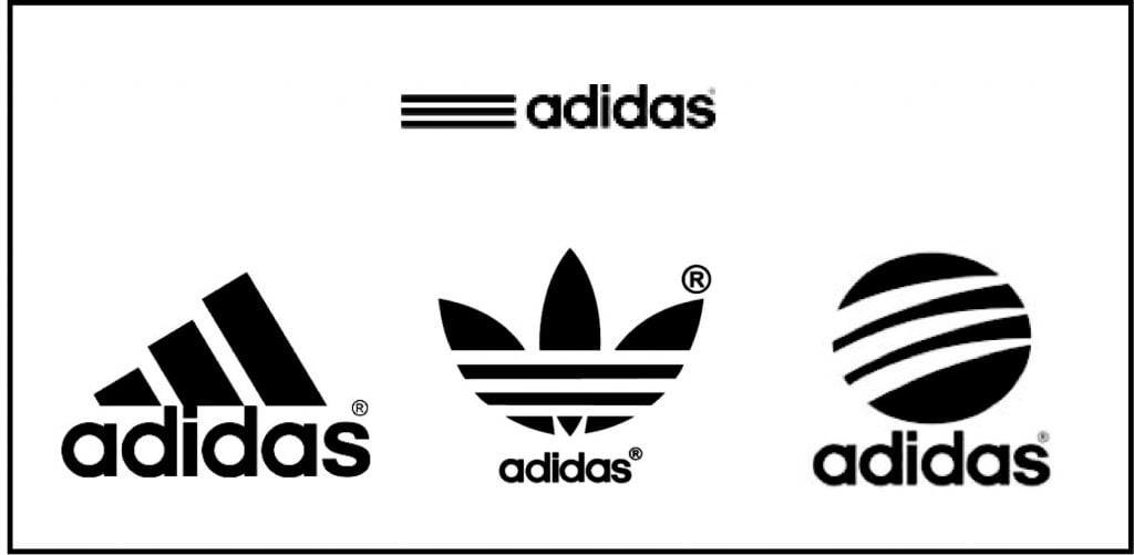
Aside from corporate branding, the latest version of the version of the logo is the Adidas Style, which depicts a circle intersected by three claw-like stripes.
Thus, there are now actually four versions of the Adidas logo: one main logo and three logos of the brands, some of which also have their own logos that are not tied to the overall company graphic.
On the one hand, it can be argued that its versatility has allowed the three-striped brand to express itself in a variety of areas - from sports to music, fashion and art. The Adidas brand has been adopted by many subcultures, such as hip-hop, graffiti, skateboarding, and so on.
At the same time, the company continued to create cutting-edge footwear models with high performance, so it was certainly becoming more and more difficult for it to keep all these areas under one logo - even though the shamrock logo was once designed to convey the diversity of Adidas products.
So the multifaceted approach to brand identification - creating different logos for different purposes - is largely based on the original meaning of the three stripes in the 1972 logo.
Just as this functional and practical design element eventually turned into a global corporate identity: the three stripes were adapted in one way or another and are present in the identity of all business lines.
This is practical, flexible, universal branding. Whenever you see you see sportswear, sneakers or equipment with three stripes, you can tell that they belong to a single brand instantly.
On the other hand, if you ask ordinary people to choose the main logo out of of the four logos, and even more so to explain the meaning of each, it is unlikely that the results the results will hardly coincide with reality. After all, the company itself is extremely illogical brands its products and stores in an extremely illogical way.
Even products from the same collection can have completely different logos on them. completely different logos. Just like in the design of shops and offices, you can several logos can be placed simultaneously. Or products of the same direction (e.g., Adidas Originals) can be sold in stores with a sign of another direction (Adidas Performance).
So in the end, the existence of several logos at the same time brings a lot of difficulties both for people who implement design in the field and for consumers.